Visual System
Graphic Elements

Our visual system is based upon the geometry of the block U. We have distilled it to three flexible approaches to accommodate assorted communication channels.
"Slices"
PRIMARY CREATIVE: USE ACROSS ALL COMMUNICATION TYPES
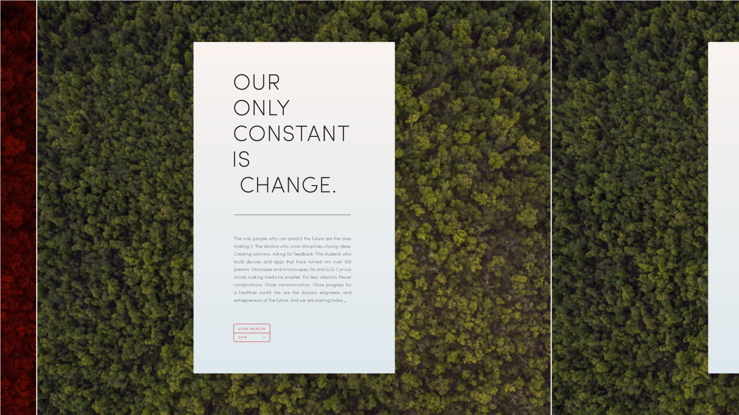
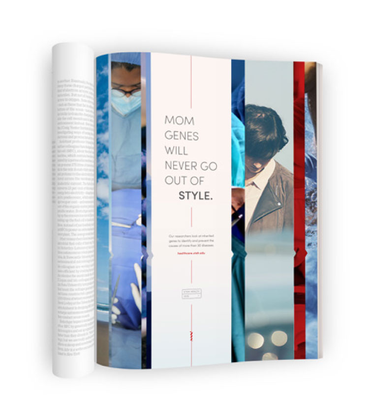
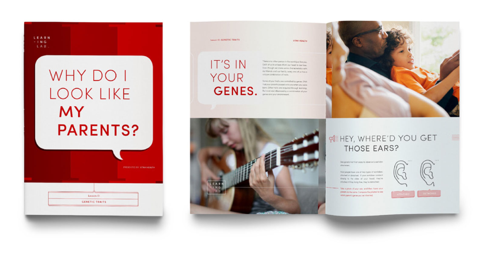
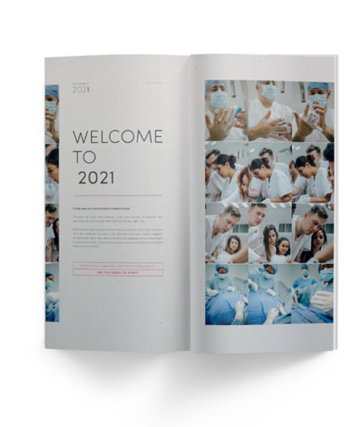
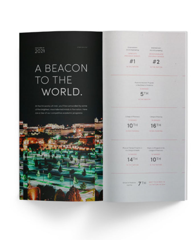
Our fundamental visual approach, Slices, is based on our foundational principle “Caring now, pioneering the future.” We leverage the past, present, and future in both content and visuals. Slices allows us to do this figuratively. This approach leaves the “center well” open for copy and populates the margins with supportive imagery. Slices also uses streamlined arrow effects to suggest momentum. As the fundamental visual approach, Slices is the creative treatment used across communication types. Typography and design are articulate, restrained, and allow content to speak for itself through white space and legible type style. Color comes from photography. Read further to learn about our narrative approaches to photography.
"Rising"
ADVERTISING CREATIVE
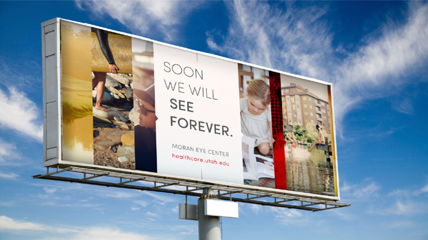
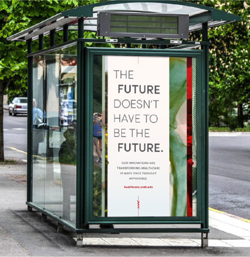
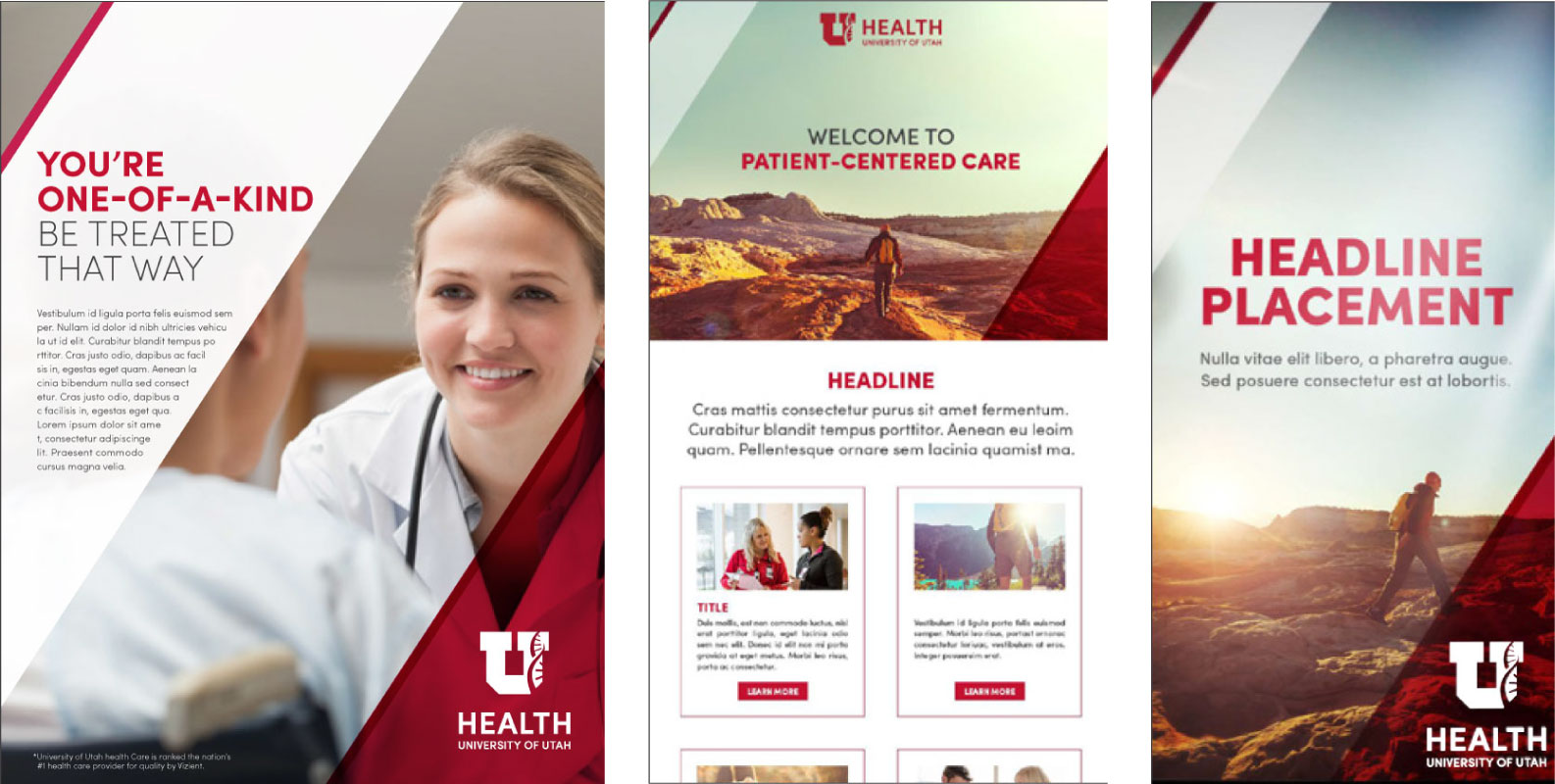
Rising picks up on the principles of Slices, but performs more assertively in the marketplace. The slices, arrow and progress effects incline to a sharper diagonal to bring more energy in marketing campaigns and collateral, suggesting an upward trajectory. The diagonal is a metaphorical nod to the mountain West. Rising introduces a transparent red “film” for an injection of brand color. These visual effects make Rising stand out in a crowded field of look-alike creative and is therefore our approach for advertising campaigns. Typography becomes more contrasting to speak a little louder without shouting. Confident and concise messaging, coupled with precise design, allow us to stand out in cluttered channels from social media to other print and digital advertising platforms.
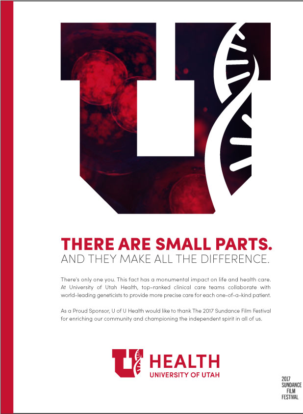
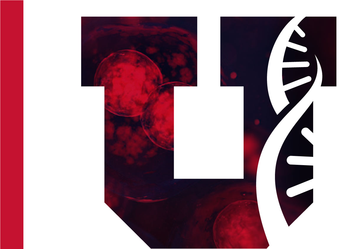
"Simplified U"
BRAND SPECIFIC CREATIVE
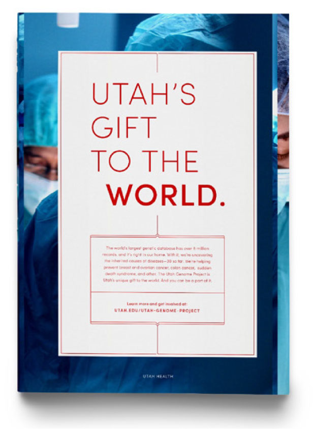
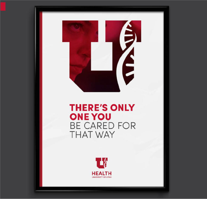
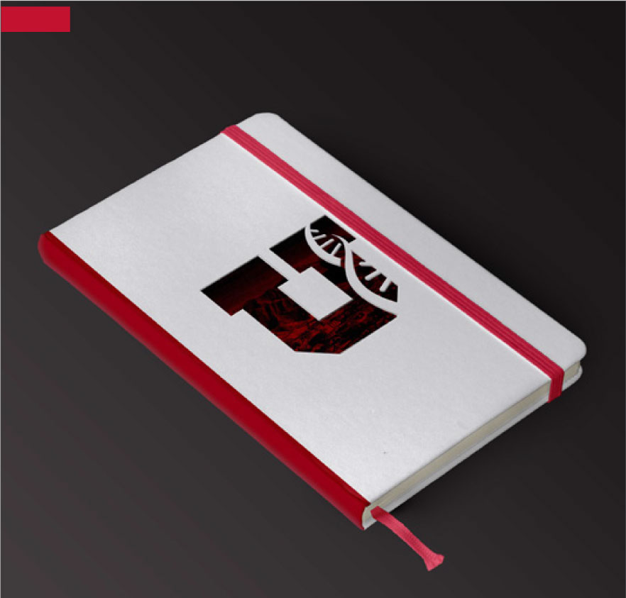
Simplified U is our most distilled approach to visual communication. It places the emphasis on the block U, and builds upon the red film visual from Rising to highlight hero images of patients and/or practitioners which, combined with the DNA helix, supports the patient-centric message central to the U of U Health brand. Because this is bold creative, it will be used in specific executions where we want to emphasize a clear brand message.
Graphic Examples
"Slices"
"Rising"

"Simplified U"

Graphic Moves
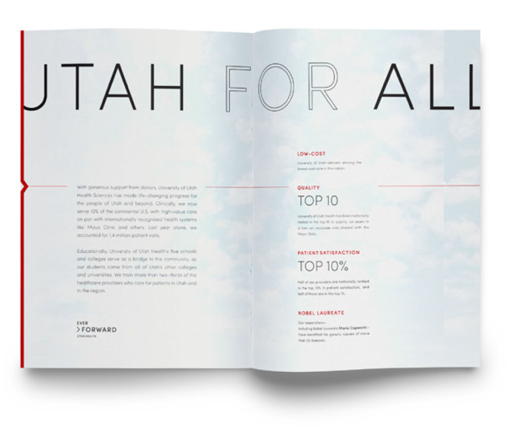
A prominent theme in the U of U Health brand is the idea of “the past, present, and future.” Each future breakthrough in science and medicine will be influenced by our accomplishments of the past, and our current goals to shape the future. You can bring this idea to life by bleeding content off the edge of the page, and repeating identical content, with one small change to each iteration.
This arrow and line device is used to lead the eye into body copy. It should always begin at the border of a page. Using this element gives the piece a feeling of forward momentum and progress. The line is also used to carry the reader across the page (as a timeline of sorts), highlighting content along the way.
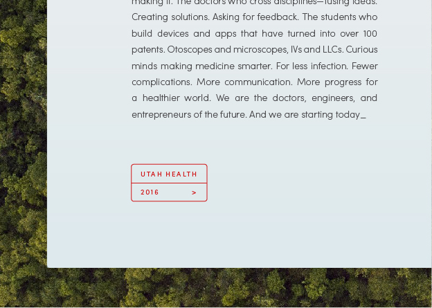
Compartmentalization brings a level of organization and structure to the U of U Health brand. Use containers to highlight small bits of information, like a ca0l4l to action, website, or statistic. Use rectangles with rounded corners (radius .0278 in for InDesign, and 4 px for web design) to soften the container and make it more inviting. To contrast with the body copy, the containers should be outlined in red, and the type within them should be in all caps.

Compartmentalization brings a level of organization and structure to the U of U Health brand. Use containers to highlight small bits of information, like a ca0l4l to action, website, or statistic. Use rectangles with rounded corners (radius .0278 in for InDesign, and 4 px for web design) to soften the container and make it more inviting. To contrast with the body copy, the containers should be outlined in red, and the type within them should be in all caps.