Big Lists
Last Updated: December 3, 2018
Big lists are for long lists, mainly lists of links, that would otherwise look plain and boring.
Use
Generally, big lists are only used on pages where the list is the only content on the page, like on conditions/treatments listing pages. Therefore, big lists typically include a filter box at the top.
All list items when a stand-alone item, or a heading for a sub-list, or as a sub-list item can include an anchor, but this isn't required. (If it's not linked, it will not be underlined.)
Code
<ul class="m-big-list">
    <li class="m-big-list__item"><a class="m-big-list__link" href="#">Item 1</a></li>
    <li class="m-big-list__item"><span class="m-big-list__heading">Item 2, No Link</span></li>
    <li class="m-big-list__item"><a class="m-big-list__link" href="#">Item 3</a>
        <ul class="m-big-list__sub-list">
            <li class="m-big-list__sub-item"><a class="m-big-list__sub-link" href="#">Sub-Item 1</a></li>
            <li class="m-big-list__sub-item"><a class="m-big-list__sub-link" href="#">Sub-Item 2</a></li>
        </ul>
    </li>
</ul>
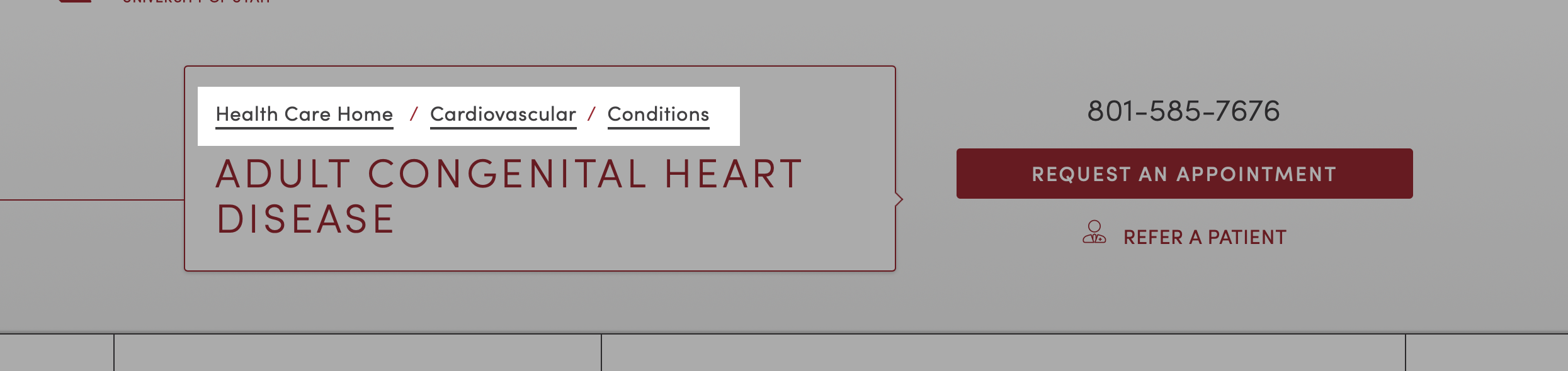
Breadcrumbs
Last Updated: December 3, 2018
Basic breadcrumb element.
Use
Breadcrumbs are a secondary navigation element that helps provide a sense of place (where am I?), and provides error correction if a user feels they are not where they should be.
These are automatically-generated molecules that should never be hardcoded or used anywhere other than the following locations within the site UI:

Code
<ol class="m-breadcrumbs">
    <li class="m-breadcrumbs__crumb"><a class="a-link">Home</a></li>
    <li class="m-breadcrumbs__crumb"><a class="a-link">Sub Page</a></li>
</ol>
Button Groups
Last Updated: December 3, 2018
Button groups are a way to visually group buttons with related functions. These should be used judiciously, primarily to provide UI fuctionality (such as to mimic navigational tabs), or as call-to-action buttons.
Use
Can be styled as follows:
Horizontal
To group related buttons together you can use the .m-button-group wrapping element. This will bunch the buttons together and remove the spacing between them.
m-button-group--nowrap will stop the text inside from wrapping to new lines. m-button-group--flex-nowrap will stop the buttons themselves from wrapping to new lines.
Code
<ul class="m-button-group">
    <li class="m-button-group__item"><a href="#" class="m-button-group__link">Button</a></li>
    <li class="m-button-group__item"><a href="#" class="m-button-group__link">Button</a></li>
    <li class="m-button-group__item"><a href="#" class="m-button-group__link">Button</a></li>
</ul>
Equal Widths
Adding the m-button-group--equal class will make buttons equal width even if text lengths are significantly different.
Code
<ul class="m-button-group  m-button-group--equal">
    <li class="m-button-group__item"><a href="#" class="m-button-group__link">Short Text</a></li>
    <li class="m-button-group__item"><a href="#" class="m-button-group__link">A Button With Much Longer Text</a></li>
    <li class="m-button-group__item"><a href="#" class="m-button-group__link">More Short Text</a></li>
</ul>
Vertical
Button groups can be made vertical by adding the .m-button-group--vertical class.
Code
<ul class="m-button-group  m-button-group--vertical">
    <li class="m-button-group__item"><a href="#" class="m-button-group__link">Button</a></li>
    <li class="m-button-group__item"><a href="#" class="m-button-group__link">Button</a></li>
    <li class="m-button-group__item"><a href="#" class="m-button-group__link">Button</a></li>
</ul>
Icons
To add icons to button groups, add a m-button-group__link--icon-horizontal or m-button-group__link--icon-vertical class to the link and add the SVG inside the link. The icon must also have two classes, m-button-group__icon and a directional modifier class: m-button-group__icon--top, m-button-group__icon--left, m-button-group__icon--bottom, m-button-group__icon--right.
Code
<ul class="m-button-group  m-button-group--equal">
    <li class="m-button-group__item">
        <a class="m-button-group__link  m-button-group__link--icon-vertical" href="#">
            <svg class="a-icon  m-button-group__icon  m-button-group__icon--top">
                <use xlink:href="../images/svg/icons.svg#doctor"></use>
            </svg>
            Button 1
        </a>
    </li>
    <li class="m-button-group__item">
        <a class="m-button-group__link  m-button-group__link--icon-vertical" href="#">
            <svg class="a-icon  m-button-group__icon  m-button-group__icon--top">
                <use xlink:href="../images/svg/icons.svg#location"></use>
            </svg>
            Button 2
        </a>
    </li>
    <li class="m-button-group__item">
        <a class="m-button-group__link  m-button-group__link--icon-vertical" href="#">
            <svg class="a-icon  m-button-group__icon  m-button-group__icon--top">
                <use xlink:href="../images/svg/icons.svg#stethoscope"></use>
            </svg>
            Button 3
        </a>
    </li>
</ul>
<ul class="m-button-group  m-button-group--vertical">
    <li class="m-button-group__item">
        <a class="m-button-group__link  m-button-group__link--icon-horizontal" href="#">
            <svg class="a-icon  m-button-group__icon  m-button-group__icon--left">
                <use xlink:href="../images/svg/icons.svg#doctor"></use>
            </svg>
            Button 1
        </a>
    </li>
    <li class="m-button-group__item">
        <a class="m-button-group__link  m-button-group__link--icon-horizontal" href="#">
            <svg class="a-icon  m-button-group__icon  m-button-group__icon--left">
                <use xlink:href="../images/svg/icons.svg#location"></use>
            </svg>
            Button 2
        </a>
    </li>
    <li class="m-button-group__item">
        <a class="m-button-group__link  m-button-group__link--icon-horizontal" href="#">
            <svg class="a-icon  m-button-group__icon  m-button-group__icon--left">
                <use xlink:href="../images/svg/icons.svg#stethoscope"></use>
            </svg>
            Button 3
        </a>
    </li>
</ul>
Dropdowns
Dropdowns are not currently implemented on the website. Dropdowns can be added to buttons in the button group when HTML is formatted in the following manner.
Code
<ul class="m-button-group">
    <li class="m-button-group__item">
        <a class="m-button-group__link" href="#">Button 1</a>
    </li>
    <li class="m-button-group__item  m-button-group__link--icon-horizontal  has-dropdown">
        <a class="m-button-group__link" href="#resources">
            Button 2
            <svg class="m-button-group__icon--right  a-icon  a-icon--xsmall  u-fill-currentColor">
                <use xlink:href="../images/svg/icons.svg#arrow-down"></use>
            </svg>
        </a>
        <ul class="m-button-group__dropdown-list  u-higher">
            <li class="m-button-group__dropdown-item">
                <a class="m-button-group__dropdown-link" href="#">Dropdown Button 1</a>
            </li>
            <li class="m-button-group__dropdown-item">
                <a class="m-button-group__dropdown-link" href="#">Dropdown Button 2</a>
            </li>
            <li class="m-button-group__dropdown-item">
                <a class="m-button-group__dropdown-link" href="#">Dropdown Button 3</a>
            </li>
        </ul>
    </li>
    <li class="m-button-group__item">
        <a class="m-button-group__link" href="#">Button 3</a>
    </li>
</ul>
Button Lists
Last Updated: December 3, 2018
Used for a list of links to provide more visual interest than a simple <ul> or <ol>. Comes in standard-size or big button flavors.
Standard Buttons
Use
The styling for button lists is minimal. The bulk comes from the grid classes and button classes.
Recommended 👍
Use for lists of links with items containing no more than a line or two of text.
On desktop, should usually be spread across three columns.
Not Recommended 👎
Avoid using with lists that have a large number of list items (more than 9 or so); larger lists present usability issues (such as: lower scanability). For longer lists consider using the A-Z Lists organism instead.
Code
<ul class="m-button-list  l-grid">
    <li class="m-button-list__item  l-grid__item  1/1  1/2@small  1/3@large">
        <a class="m-button-list__button  a-button  a-button--expand  a-button--small" href="#">Button</a>
    </li>
    <li class="m-button-list__item  l-grid__item  1/1  1/2@small  1/3@large">
        <a class="m-button-list__button  a-button  a-button--expand  a-button--small" href="#">Lists</a>
    </li>
    <li class="m-button-list__item  l-grid__item  1/1  1/2@small  1/3@large">
        <a class="m-button-list__button  a-button  a-button--expand  a-button--small" href="#">are</a>
    </li>
    <li class="m-button-list__item  l-grid__item  1/1  1/2@small  1/3@large">
        <a class="m-button-list__button  a-button  a-button--expand  a-button--small" href="#">Lots</a>
    </li>
    <li class="m-button-list__item  l-grid__item  1/1  1/2@small  1/3@large">
        <a class="m-button-list__button  a-button  a-button--expand  a-button--small" href="#">of</a>
    </li>
    <li class="m-button-list__item  l-grid__item  1/1  1/2@small  1/3@large">
        <a class="m-button-list__button  a-button  a-button--expand  a-button--small" href="#">Fun</a>
    </li>
    <li class="m-button-list__item  l-grid__item  1/1">
        <a class="m-button-list__button  a-button  a-button--expand" href="#">View All</a>
    </li>
</ul>
Big Buttons
Use
To be used with content that requires stronger visual distinction and/or with longer text.
Code
<ul class="m-button-list  m-button-list--large  l-grid">
    <li class="m-button-list__item  l-grid__item  1/1  1/2@medium">
        <a class="m-button-list__button  a-button  a-button--expand  a-button--large" href="#">How do you get cancer of the anus?</a>
    </li>
    <li class="m-button-list__item  l-grid__item  1/1  1/2@medium">
        <a class="m-button-list__button  a-button  a-button--expand  a-button--large" href="#">How can doctors tell if anal cancer has spread?</a>
    </li>
    <li class="m-button-list__item  l-grid__item  1/1  1/2@medium">
        <a class="m-button-list__button  a-button  a-button--expand  a-button--large" href="#">How does cancer spread?</a>
    </li>
    <li class="m-button-list__item  l-grid__item  1/1  1/2@medium">
        <a class="m-button-list__button  a-button  a-button--expand  a-button--large" href="#">Treatments for anal cancer at Huntsman Institute</a>
    </li>
</ul>
Callout Boxes
Last Updated: December 3, 2018
Callout boxes are used for the main call-to-action on a page.
Use
Recommended 👍
They're used to present phone number and appointment request buttons. They can additionally display a reffering doctor link.
These boxes will fill the available space. Wrap inside a grid element to achieve the desired width.
Not Recommended 👎
Do not use these callout boxes within the body of a page. Instead, use the simple unlinked card molecule.
Standard
By default, callout boxes have no background.
Code
<div class="m-callout">
    <a class="m-callout__phone" href="tel:1-800-555-5555">(800) 555-5555</a>
    <a class="m-callout__button" href="#">Schedule an Appointment</a>
    <a class="m-callout__refer" href="#">Refer a Patient</a>
</div>
Background
Adding the m-callout--white class will give the callout a slightly transparent white background. This is mainly used for image billboards.
Code
<div class="u-bg-black" style="padding:1em;">
    <div class="m-callout  m-callout--white">
        <a class="m-callout__phone" href="tel:1-800-555-5555">(800) 555-5555</a>
        <a class="m-callout__button" href="#">Schedule an Appointment</a>
        <a class="m-callout__refer" href="#">Refer a Patient</a>
    </div>
</div>
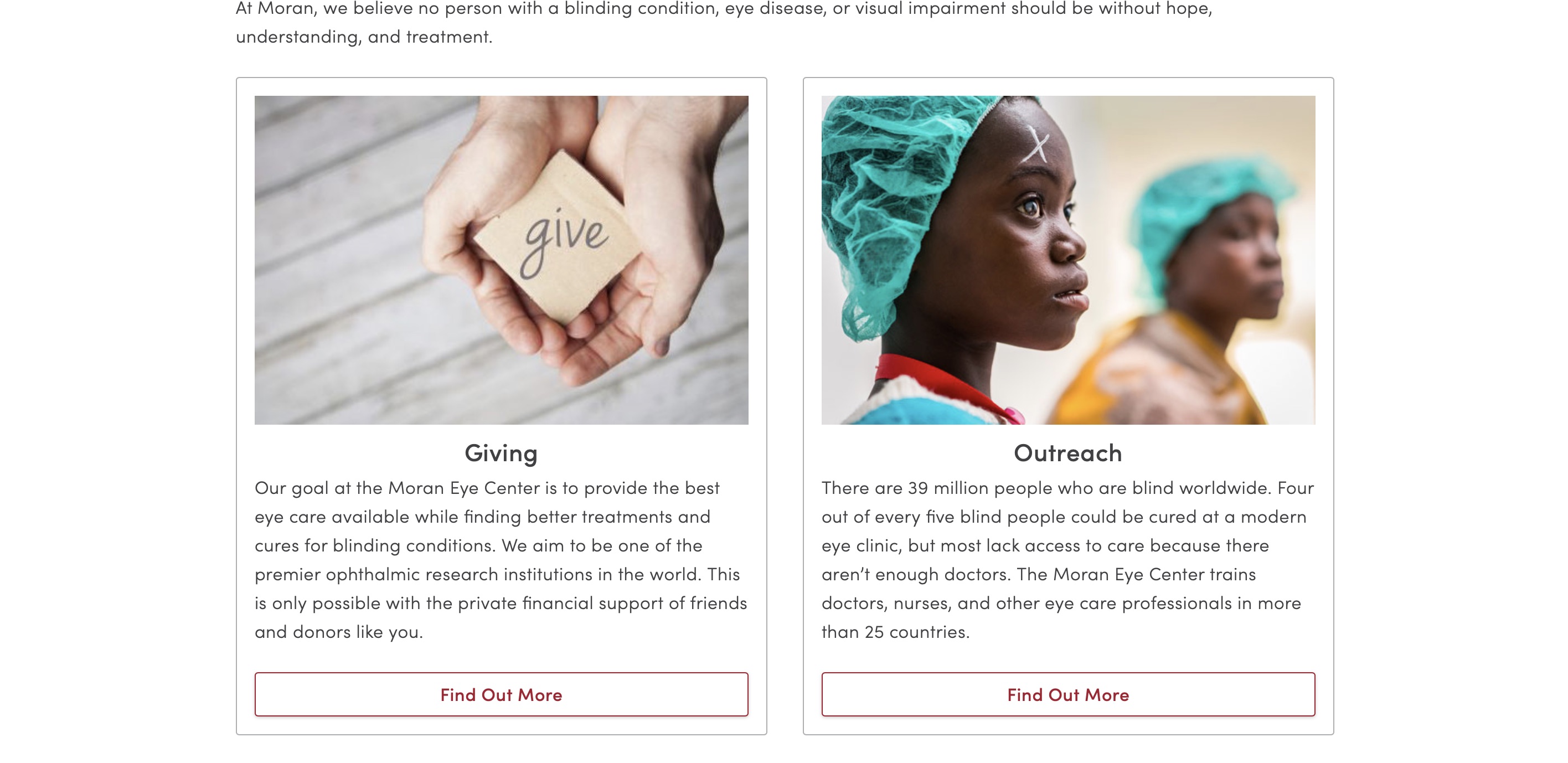
Cards
Last Updated: December 3, 2018
Cards are a common minimalistic design tool used to segregate sections of content. We're using cards to link to pages that aren't specialties, procedures, or programs.
Use
Cards are a good way to separate certain content from the rest of a pages content. They can be grouped (using grid classes) to group cards with related content (such as a related articles section).
Notice the entire card is wrapped in an anchor tag, and the call-to-action is a button. This makes the entire card clickable. (Excepting simple unlinked cards, of course.)
Available versions:
- Default, with no border
- Bordered
- Simple linked
- Simple unlinked
- Locations unlinked (a.k.a. find a location cards)
No Border (default)
Better used as full-width or two-column cards. Any more than that and each card may not have enough visual separation from the others.

Code
<a class="m-card" href="#">
    <img class="m-card__image" data-original="https://placehold.it/900x360">
    <header class="m-card__header">
        <h3 class="m-card__heading">Card Title</h3>
    </header>
    <div class="m-card__body">
        <p class="a-paragraph">Lorem ipsum dolor sit amet, consectetur adipiscing elit. Proin imperdiet facilisis est sed faucibus. Mauris et dolor at neque tincidunt feugiat ut at turpis. Suspendisse potenti...</p>
    </div>
    <footer class="m-card__footer">
        <button class="a-button  a-button--brand  a-button--expand">Read More</button>
    </footer>
</a>
Bordered
Code
<a class="m-card  m-card--bordered" href="#">
    <img class="m-card__image" data-original="https://placehold.it/900x360">
    <header class="m-card__header">
        <h3 class="m-card__heading">Card Title</h3>
    </header>
    <div class="m-card__body">
        <p class="a-paragraph">Lorem ipsum dolor sit amet, consectetur adipiscing elit. Proin imperdiet facilisis est sed faucibus. Mauris et dolor at neque tincidunt feugiat ut at turpis. Suspendisse potenti...</p>
    </div>
    <footer class="m-card__footer">
        <button class="a-button  a-button--brand  a-button--expand">Read More</button>
    </footer>
</a>
Simple Linked Cards
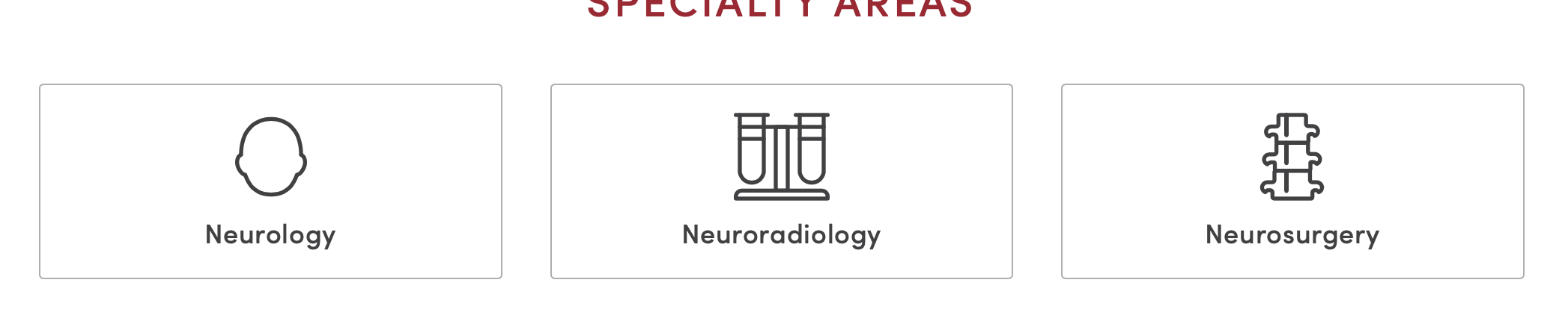
Simple cards are an icon with a heading. These are often used inside a grid layout.
Code
<div class="l-grid  u-space-top--medium  u-space-top--large@medium">
    <div class="l-grid__item  1/1  1/2@small  1/3@large  u-flex">
        <a class="m-card  m-card--bordered  u-flex-grow" href="#">
            <svg class="m-card__image  a-icon  a-icon--super">
                <use xlink:href="../images/svg/icons.svg#family"></use>
            </svg>
            <header class="m-card__header">
                <h5 class="m-card__heading">Example 1</h5>
            </header>
        </a>
    </div>
    <div class="l-grid__item  1/1  1/2@small  1/3@large  u-flex">
        <a class="m-card  m-card--bordered  u-flex-grow" href="#">
            <svg class="m-card__image  a-icon  a-icon--super">
                <use xlink:href="../images/svg/icons.svg#baby"></use>
            </svg>
            <header class="m-card__header">
                <h5 class="m-card__heading">Example 2</h5>
            </header>
        </a>
    </div>
    <div class="l-grid__item  1/1  1/2@small  1/3@large  u-flex">
        <a class="m-card  m-card--bordered  u-flex-grow" href="#">
            <svg class="m-card__image  a-icon  a-icon--super">
                <use xlink:href="../images/svg/icons.svg#stethoscope"></use>
            </svg>
            <header class="m-card__header">
                <h5 class="m-card__heading">Example 3</h5>
            </header>
        </a>
    </div>
</div>
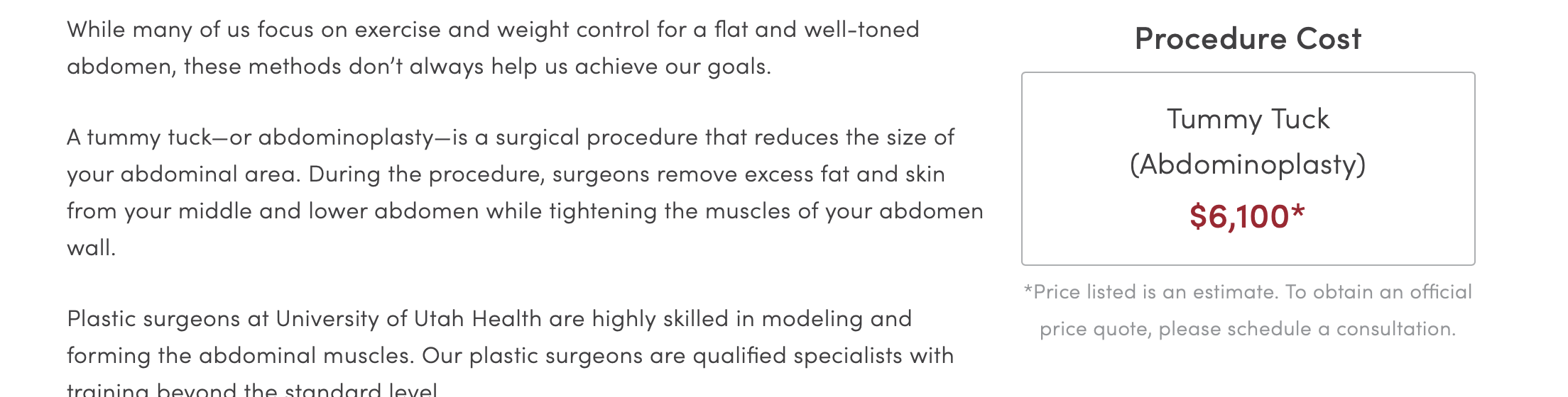
Simple Unlinked Cards
Best used as a single card, wrapped in "u-pull-right" <div>. Use <h3> (placed before the "m-card" <div> and inside the "u-pull-right" <div>) to give the card a title; may also use <small class="u-color-grey"> (placed after the "m-card" <div> and inside the "u-pull-right" <div>) as a caption/footnote to the card.
Code
Procedure Cost
Liposuction (one area)
$3,300*
Lorem ipsum dolor sit amet, consectetur adipiscing elit. Pellentesque tincidunt suscipit faucibus. Ut eleifend risus vitae eros rutrum, interdum dapibus nibh aliquam. Sed et felis mauris. Aliquam elit dui, accumsan nec erat id, blandit pulvinar orci.
Vestibulum elit tellus, convallis efficitur justo id, consectetur pretium diam. Aenean pretium a massa quis posuere. Etiam vel malesuada velit. Duis est diam, rutrum condimentum ullamcorper eget, egestas ac massa. Praesent ligula leo, iaculis ut sem in, interdum porttitor augue. Maecenas consectetur eros in porttitor blandit.
<div class="o-content">
    <div class="u-pull-right  u-text-align--center">
        <h3 class="u-space-top--xsmall">Procedure Cost</h3>
        <div class="m-card  m-card--bordered  u-flex-grow  u-space-bottom--xsmall">
            <header class="m-card__header">
                <p class="u-large  u-no-space">Liposuction (one area)</p>
                <p class="u-xlarge  u-bold  u-color-brand  u-no-space">$3,300*</p>
            </header>
        </div>
        <small class="u-color-grey">* Price listed is an estimate.</small>
    </div>
    <p>Lorem ipsum dolor sit amet, consectetur adipiscing elit. Pellentesque tincidunt suscipit faucibus. Ut eleifend risus vitae eros rutrum, interdum dapibus nibh aliquam. Sed et felis mauris. Aliquam elit dui, accumsan nec erat id, blandit pulvinar orci.</p>
    <p>Vestibulum elit tellus, convallis efficitur justo id, consectetur pretium diam. Aenean pretium a massa quis posuere. Etiam vel malesuada velit. Duis est diam, rutrum condimentum ullamcorper eget, egestas ac massa. Praesent ligula leo, iaculis ut sem in, interdum porttitor augue. Maecenas consectetur eros in porttitor blandit.</p>
</div>
Find A Location Cards
Full-featured cards that can list more location-related info such as phone numbers, hours, addresses, etc. The whole card is not clickable, but contains links on the image, button, "Get Directions" text, and any other relevant links.
Provides filter-based highlighted areas (such as when the pharmacy filter is selected, the pharmacy hours are highlighted).
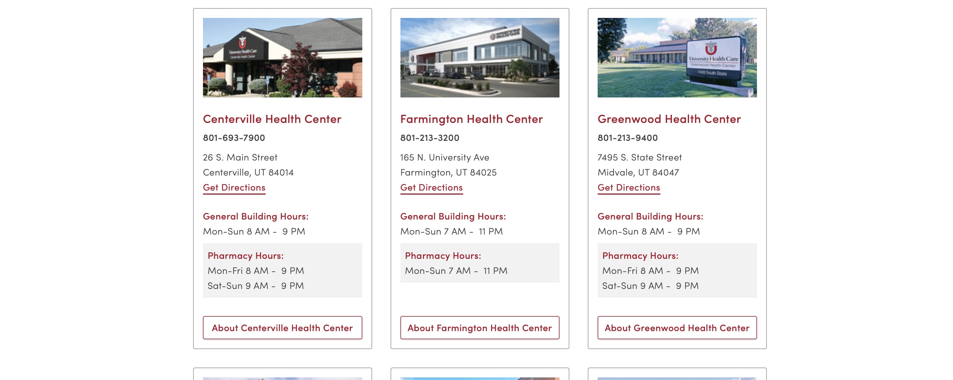
Code
801-213-3200
165 N. University Ave
Farmington, UT 84025
Get Directions
<div class="m-dropdown-items u-flex u-justify-between l-grid__item 3/4 u-space-bottom--medium ng-scope">
    <div class="m-card u-border-all u-border--grey">
        <a class="u-border-none" target="_self" href="//healthcare.utah.edu/locations/farmington/index.php">
            <div class="u-ratio  u-ratio--21x9 u-ratio--2x1@medium" style="background-image: url(//healthcare.utah.edu/locations/_images/farmington-new.jpg); background-size: cover;background-position: center;"></div>
        </a>
        <a class="u-border-none" target="_self" href="//healthcare.utah.edu/locations/farmington/index.php">
            <div class="u-large u-color-brand u-bold u-space-top--medium ng-binding">Farmington Health Center</div>
        </a>
        <div class="m-card__body">
            <p class="u-bold u-no-space u-space-top--xsmall u-space-bottom--small ng-binding">801-213-3200</p>
            <p class="u-no-space u-space-bottom--large ng-binding">165 N. University Ave<br> Farmington, UT 84025<br><a target="_blank" href="https://www.google.com/maps/dir//165 N. University Ave Farmington UT 84025">Get Directions</a></p>
            <div class="u-space-bottom--small">
                <div class="u-bold u-color-brand">General Building Hours:</div>
                <div style="white-space: pre;" class="ng-binding">Mon-Sun 7 AM -  11 PM</div>
            </div>
            <div class="seperate-hours urgent-hours u-space-bottom--small" style="">
                <div class="u-bold u-color-brand">Urgent Care Hours:</div>
                <div style="white-space: pre;" class="ng-binding">Mon-Sun 7 AM -  11 PM</div>
            </div>
            <div class="seperate-hours pharmacy-hours u-space-bottom--small">
                <div class="u-bold u-color-brand">Pharmacy Hours:</div>
                <div style="white-space: pre;" class="ng-binding">Mon-Sun 7 AM -  11 PM</div>
            </div>
        </div>
        <div class="m-card__footer">
            <a class="a-button a-button--brand a-button--expand ng-binding" target="_self" href="//healthcare.utah.edu/locations/farmington/index.php">About Farmington Health Center</a>
        </div>
    </div>
</div>
Content Banner
Last Updated: December 3, 2018
Content banners are a great way to showcase patient stories and other content.
Use
Typically content banners are used in conjunction with o-section organisms.
If the background image is dark, use the o-section--inverse class to make the text white.

Code
<section class="o-section  o-section--inverse  m-content-banner" style="background-image:url('../images/pattern-library/molecules/content-banner.jpg');">
    <div class="l-container  l-container--large">
        <h2 class="o-section__header  m-content-banner__heading">In Vitro Fertilization Helps Couple Become a Family</h2>
        <p class="m-content-banner__message  a-paragraph">Melissa and Sam Olson always wanted children. However, their attempts to conceive had been unsuccessful due to a condition called endometriosis which affected Melissa's reproductive organs...</p>
        <div class="m-content-banner__cta">
            <a class="a-button  a-button--brand" href="#">Read Full Story</a>
        </div>
    </div>
</section>
Events
Last Updated: December 3, 2018
Events is a molecule used to display calendar events.
Use
Currently, only used on main landing pages. Used sparingly.
Displayed as a single column next to other content.
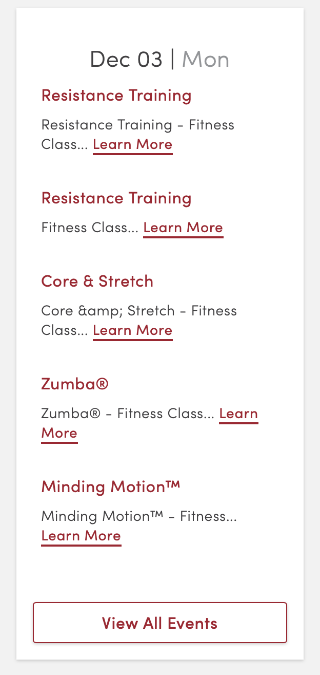
Code
Dec 03 | Mon
Resistance Training - Fitness Class... Learn More
Fitness Class... Learn More
Core & Stretch - Fitness Class... Learn More
Zumba® - Fitness Class... Learn More
Minding Motion™ - Fitness... Learn More
<div class="m-events u-bg-white u-high u-space-bottom--medium u-space-bottom--xlarge@small">
<div class="m-events__day">
<h3 class="m-events__heading">
<span>Dec 03</span>
<span> | </span>
<span class="u-color-grey">Mon</span>
</h3>
<div class="m-events__event">
<a class="m-events__event-title" href="#">Resistance Training</a>
<p class="m-events__event-description">Resistance Training - Fitness Class... <a href="#">Learn More</a></p>
</div>
<div class="m-events__event">
<a class="m-events__event-title" href="#">Resistance Training</a>
<p class="m-events__event-description">Fitness Class... <a href="#">Learn More</a></p>
</div>
<div class="m-events__event">
<a class="m-events__event-title" href="#">Core & Stretch</a>
<p class="m-events__event-description">Core &amp; Stretch - Fitness Class... <a href="#">Learn More</a></p>
</div>
<div class="m-events__event">
<a class="m-events__event-title" href="#">Zumba®</a>
<p class="m-events__event-description">Zumba® - Fitness Class... <a href="#">Learn More</a></p>
</div>
<div class="m-events__event">
<a class="m-events__event-title" href="#">Minding Motion™</a>
<p class="m-events__event-description">Minding Motion™ - Fitness... <a href="#">Learn More</a></p>
</div>
</div>
<div class="u-padding--medium">
<a class="a-button a-button--brand a-button--expand" href="#">View All Events</a>
</div>
</div>
Forms + Input Molecules
Some form elements are collections of atoms. Therefore, these are molecules. For other form inputs see the inputs section in atoms.
Accessibility Considerations
Placeholder text
Placeholder text should not be used to give instructions to a user on how to use a form field. Most screen readers do not read the placeholder text. The <label> tag should be used for this text. In some cases, the "u-visuallyhidden" visibility class can be used to hide the label from all users, except those using screen readers.
Use
The available form input molecules are:
- Inputs with icons (such as a search bar)
- Fieldsets and legends
- Labels and form elements
- Filtering data
- Dropdown search/filter
Inputs with Icons (Read: Search Bar)
Generally, this will only be used with the search icon.
Code
<div class="m-field  m-field--icon-left u-space-bottom--medium">
    <svg class="a-icon">
        <use xlink:href="../images/svg/icons.svg#search-icon"></use>
    </svg>
    <input class="a-field" type="text">
</div>
Fieldsets and Legends
Use .m-fieldset and .m-fieldset__legend classes to apply consistent fieldset behaviours.
Code
<fieldset class="m-fieldset">
    <legend class="m-fieldset__legend">A group of controls</legend>
    <label class="a-field  a-field--choice">
        <input type="radio" name="optionsRadios">
        Option one
    </label>
    <label class="a-field  a-field--choice">
        <input type="radio" name="optionsRadios">
        Option two
    </label>
    <label class="a-field  a-field--choice">
        <input type="radio" name="optionsRadios">
        Option three
    </label>
    <label class="a-field  a-field--choice">
        <input type="radio" name="optionsRadios">
        Option four
    </label>
</fieldset>
Labels and Form Elements
See Accessibility Considerations above for why labels should be used, not just placeholder text.
Code
<!-- Approach one -->
<div class="m-form-element">
    <label class="a-label" for="nickname">Nickname:</label>
    <input id="nickname" placeholder="Nickname" class="a-field">
</div>
<!-- Approach two -->
<label class="a-label  m-form-element">
    Real name:
    <input class="a-field  a-field--label" placeholder="Real name">
</label>
Filtering Data
Filtering data is a combination of an input element and a simple dataset--usually an unordered list. Add the js-filter__input class to an input, add the js-filter__data class to a list, and create a message to display if all results are filtered with the js-filter__empty class. Utility classes can be added to any element to adjust styling. For example: the u-2col class can be added to the list to split it into two columns.
Note: Currently only one filter can be used per page.
Code
<div class="m-field  u-space-bottom--small">
  <input class="js-filter__input  a-field  a-field--emphasis  u-low" type="text" placeholder="Filtering Example" />
</div>
<p class="js-filter__empty  u-xlarge" style="display: none;">Sorry, no results were found.</p>
<ul class="js-filter__data  a-list--unstyled">
  <li class="u-padding-top--large  u-padding--bottom--large"><a class="u-color-black" href="#">Allergy</a></li>
  <li class="u-padding-top--large  u-padding--bottom--large"><a class="u-color-black" href="#">Bariatric Surgery</a></li>
  <li class="u-padding-top--large  u-padding--bottom--large"><a class="u-color-black" href="#">Behavioral Health</a></li>
  <li class="u-padding-top--large  u-padding--bottom--large"><a class="u-color-black" href="#">Cardiology</a></li>
</ul>
Dropdown Search/Filter
Used to filter search results when there is a long list of available filters.
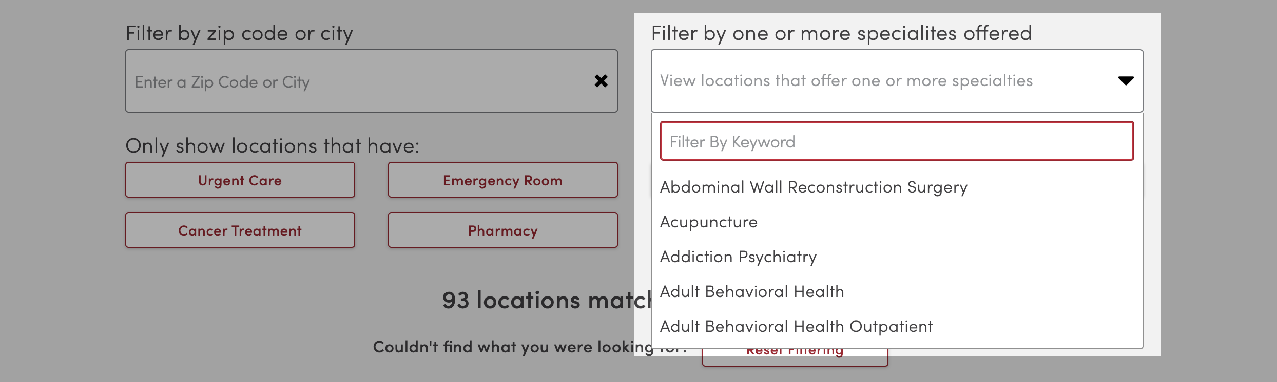
Code
Due to lack of necessary code to display this molecule here, please visit the Find A Location page to see it in action.
Image Captions
Last Updated: December 3, 2018
These classes create caption overlays for images. They are primarily used in conjunction with the billboard or swiper organisms.
Use
Can be used with the following options:
- Colors & Boxes (use one)
- Positioning (use one, in conjunction with one of the above style classes)
Dark
Dark captions have a darkened, semi-transparent background with light text.
Code
<header class="o-billboard  o-billboard--bg-image  o-billboard--small  l-container  l-container--super  l-container--flush" role="banner">
    <div class="o-billboard__image-wrapper  o-billboard__image-wrapper--gradient" style="background-image:url('https://placehold.it/1200x400/ACC7BF/fff');">
        <img alt="" class="o-billboard__image o-billboard__image-wrapper--gradient" style="opacity:0;" src="https://placehold.it/1200x400/ACC7BF/fff">
    </div>
    <div class="o-billboard__content">
        <div class="o-billboard__header"></div>
        <div class="o-billboard__body"></div>
        <div class="o-billboard__footer">
            <div class="m-caption  m-caption--dark">
                <div class="l-container  l-container--large">
                    <h1 class="m-caption__heading">Heading</h1>
                    <p class="m-caption__subheading">Subheading</p>
                </div>
            </div>
        </div>
    </div>
</header>
Light
Light captions have a lightened, semi-transparent background and dark text.
Code
<header class="o-billboard  o-billboard--bg-image  o-billboard--small  l-container  l-container--super  l-container--flush" role="banner">
    <div class="o-billboard__image-wrapper  o-billboard__image-wrapper--gradient" style="background-image:url('https://placehold.it/1200x400/ACC7BF/fff');">
        <img alt="" class="o-billboard__image o-billboard__image-wrapper--gradient" style="opacity:0;" src="https://placehold.it/1200x400/ACC7BF/fff">
    </div>
    <div class="o-billboard__content">
        <div class="o-billboard__header"></div>
        <div class="o-billboard__body"></div>
        <div class="o-billboard__footer">
            <div class="m-caption  m-caption--light">
                <div class="l-container  l-container--large">
                    <h1 class="m-caption__heading">Heading</h1>
                    <p class="m-caption__subheading">Subheading</p>
                </div>
            </div>
        </div>
    </div>
</header>
Boxed Captions
To enclose the caption with a border and center align text. Currently only used on the homepage slider.
Code
<header class="o-billboard  o-billboard--bg-image  o-billboard--small  l-container  l-container--super  l-container--flush" role="banner">
    <div class="o-billboard__image-wrapper  o-billboard__image-wrapper--gradient" style="background-image:url('https://placehold.it/1200x400/ACC7BF/fff');">
        <img alt="" class="o-billboard__image o-billboard__image-wrapper--gradient" style="opacity:0;" src="https://placehold.it/1200x400/ACC7BF/fff">
    </div>
    <div class="o-billboard__content">
        <div class="o-billboard__header"></div>
        <div class="o-billboard__body"></div>
        <div class="o-billboard__footer">
            <div class="l-container  l-container--large">
                <div class="m-caption  m-caption--box  m-caption--dark  u-space-bottom--medium">
                    <h1 class="m-caption__heading">Heading</h1>
                    <p class="m-caption__subheading">Subheading</p>
                </div>
            </div>
        </div>
    </div>
</header>
Bottom
To position the caption at the bottom of the image, place <div class="m-caption m-caption--"> within the <div class="o-billboard__footer">. This is the recommended positioning for most images.
Code
<header class="o-billboard  o-billboard--bg-image  o-billboard--small  l-container  l-container--super  l-container--flush" role="banner">
    <div class="o-billboard__image-wrapper  o-billboard__image-wrapper--gradient" style="background-image:url('https://placehold.it/1200x400/ACC7BF/fff');">
        <img alt="" class="o-billboard__image o-billboard__image-wrapper--gradient" style="opacity:0;" src="https://placehold.it/1200x400/ACC7BF/fff">
    </div>
    <div class="o-billboard__content">
        <div class="o-billboard__header"></div>
        <div class="o-billboard__body"></div>
        <div class="o-billboard__footer">
            <div class="m-caption  m-caption--dark">
                <div class="l-container  l-container--large">
                    <h1 class="m-caption__heading">Heading</h1>
                    <p class="m-caption__subheading">Subheading</p>
                </div>
            </div>
        </div>
    </div>
</header>
Top
To position the caption at the top of the image, place <div class="m-caption m-caption--"> within the <div class="o-billboard__header">. Use only when a caption positioned in the bottom would obscure the primary focus of the image.
Code
Heading
Subheading
<header class="o-billboard  o-billboard--bg-image  o-billboard--small  l-container  l-container--super  l-container--flush" role="banner">
    <div class="o-billboard__image-wrapper  o-billboard__image-wrapper--gradient" style="background-image:url('https://placehold.it/1200x400/ACC7BF/fff');">
        <img alt="" class="o-billboard__image o-billboard__image-wrapper--gradient" style="opacity:0;" src="https://placehold.it/1200x400/ACC7BF/fff">
    </div>
    <div class="o-billboard__content">
        <div class="o-billboard__header">
            <div class="m-caption  m-caption--dark">
                <div class="l-container  l-container--large">
                    <h1 class="m-caption__heading">Heading</h1>
                    <p class="m-caption__subheading">Subheading</p>
                </div>
            </div>
        </div>
        <div class="o-billboard__body"></div>
        <div class="o-billboard__footer"></div>
    </div>
</header>
Pagination
Last Updated: December 4, 2018
Used to separate long lists of content into multiple pages. Primarily used in search results and index pages for sites such as The Scope, HealthFeed, etc.
Use
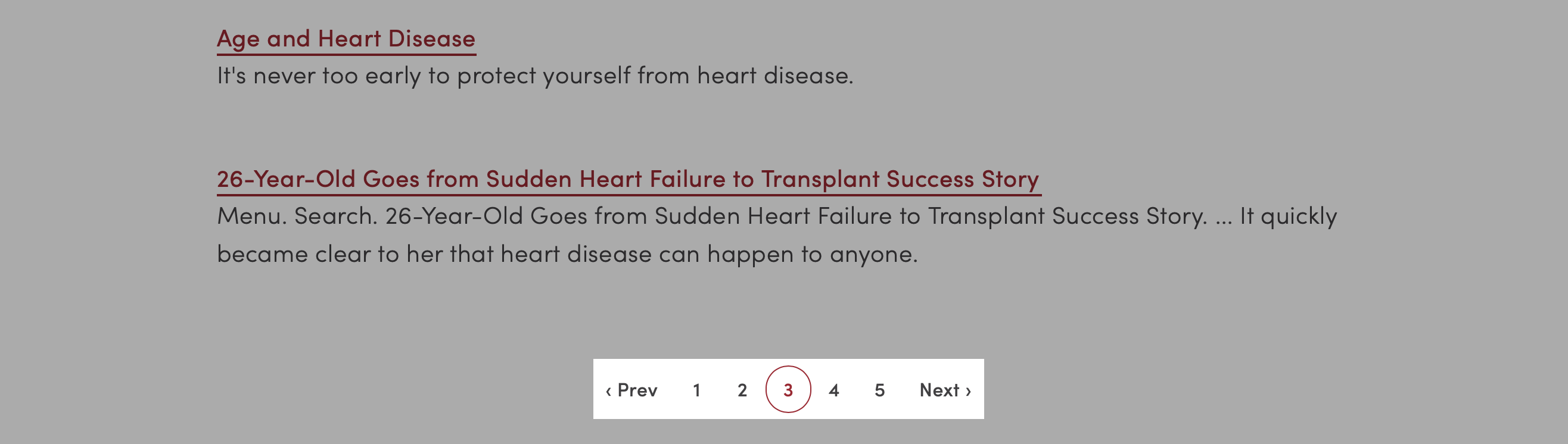
<div class="m-pagination">
    <div class="m-pagination__controls  m-pagination__controls--backward">
        <!--<button class="m-pagination__control">« First</button>-->
        <button class="m-pagination__control">‹ Prev</button>
    </div>
    <div class="m-pagination__controls">
        <button class="m-pagination__page">1</button>
        <button class="m-pagination__page  m-pagination__page--current">2</button>
        <button class="m-pagination__page">3</button>
    </div>
    <div class="m-pagination__controls  m-pagination__controls--forward">
        <button class="m-pagination__control">Next ›</button>
        <!--<button class="m-pagination__control">Last »</button>-->
    </div>
</div>
Signpost
Last Updated: December 4, 2018
Signposts are button-like elements that can be used when there is a bit too much text for a standard button.
Use
Typically the card molecule is used instead of the signpost; however on pages dominated by cards, the use of a signpost may help add visual interest to the content contained inside.
If the signpost is completely enclosed within an <a> tag, the entire element will operate like a button.
Code
(Ignore the "l-grid" divs, they are used here for presentation purposes only.)
Signpost Heading
Only the call-to-action button is linked on this signpost.
<div class="l-grid">
    <div class="l-grid__item">
        <div class="m-signpost">
            <div class="m-signpost__header">
                <h4 class="m-signpost__heading u-color-black">Signpost Heading</h4>
                <p class="m-signpost__copy">Only the call-to-action button is linked on this signpost.</p>
            </div>
            <a href="#" class="m-signpost__footer u-border-none">
                Call to Action
            </a>
        </div>
    </div>
    <div class="l-grid__item">
        <a class="m-signpost" href="#">
            <div class="m-signpost__header">
                <h4 class="m-signpost__heading u-color-black">Signpost Heading</h4>
                <p class="m-signpost__copy u-regular">This entire signpost is a link.</p>
            </div>
            <div class="m-signpost__footer">
                Call to Action
            </div>
        </a>
    </div>
</div>
Signpost Heading
Only the call-to-action button is linked on this signpost.
<div class="l-grid">
    <div class="l-grid__item">
        <div class="m-signpost m-signpost--brand">
            <div class="m-signpost__header">
                <h4 class="m-signpost__heading">Signpost Heading</h4>
                <p class="m-signpost__copy">Only the call-to-action button is linked on this signpost.</p>
            </div>
            <a href="#" class="m-signpost__footer u-border-none">
                Call to Action
            </a>
        </div>
    </div>
    <div class="l-grid__item">
        <a class="m-signpost m-signpost--brand" href="#">
            <div class="m-signpost__header">
                <h4 class="m-signpost__heading">Signpost Heading</h4>
                <p class="m-signpost__copy u-regular">This entire signpost is a link.</p>
            </div>
            <div class="m-signpost__footer">
                Call to Action
            </div>
        </a>
    </div>
</div>
Tiles
Last Updated: December 4, 2018
Tiles are what we call images with text overlaid. Tiles can be combined with ratio utilities to maintain proper aspect ratios, such as a square, at all screen sizes.
Accessibility Considerations
Due to legibility issues with placing text on top of an image, tiles should be used judiciously. Ensure that the image used provides sufficient contrast to the overlaid text.
Use
Not Recommended 👎
Tiles should be used sparingly and should not be used for an important call-to-action. Usability studies have repeatedly shown that many users will completely ignore any element that closely mirrors design conventions used for online advertising; with text over an image being the most common ad.
Recommended 👍
Tiles are made up of a wrapper element: m-tiles, individual tiles: m-tile, and each tile contains three children to position text: m-tile__header, m-tile__body, m-tile__footer. The wrapper element uses the new CSS display:grid property to maintain proper heights and widths for each tile.
Each individual tile has a minimum height of roughly 200px. Featured tiles -- described below -- have a minimum height of about 400px.
Available options for tiles are:
Default
Centered Text
Centered Text
<div class="m-tiles  m-tiles--2@medium">
    <div class="u-ratio  u-ratio--1x1">
        <div class="u-ratio__content">
            <div class="m-tile  m-tile--dark" style="background-image:url('../images/pattern-library/molecules/tiles-s-dark.jpg')">
                <div class="m-tile__header u-xlarge"></div>
                <div class="m-tile__body">
                    <p class="u-xlarge  u-line-height--title  u-text-align--center">Centered Text</p>
                </div>
                <div class="m-tile__footer u-xlarge"></div>
            </div>
        </div>
    </div>
</div>
Columns
The m-tiles wrapper can be used to set how many tiles appear in each row, with a maximum of 4. Small screens force tiles into a single column, however, on larger screens the number of tiles can be set with classes in this format: m-tiles--2@small, m-tiles--3@medium, m-tiles--4@large, etc.
<div class="m-tiles">
    <div class="m-tile m-tile--dark" style="background-image:url('../images/pattern-library/molecules/tiles-super-dark.jpg')">
        <div class="m-tile__header u-xlarge">one column</div>
        <div class="m-tile__body u-xlarge"></div>
        <div class="m-tile__footer u-xlarge"></div>
    </div>
</div>
<div class="m-tiles  m-tiles--2@medium">
    <div class="m-tile m-tile--dark" style="background-image:url('../images/pattern-library/molecules/tiles-xl-dark.jpg')">
        <div class="m-tile__header u-xlarge">two columns</div>
        <div class="m-tile__body u-xlarge"></div>
        <div class="m-tile__footer u-xlarge"></div>
    </div>
    <div class="m-tile m-tile--dark" style="background-image:url('../images/pattern-library/molecules/tiles-xl-dark.jpg')">
        <div class="m-tile__header u-xlarge">two columns</div>
        <div class="m-tile__body u-xlarge"></div>
        <div class="m-tile__footer u-xlarge"></div>
    </div>
</div>
<div class="m-tiles  m-tiles--3@medium">
    <div class="m-tile m-tile--dark" style="background-image:url('../images/pattern-library/molecules/tiles-l-dark.jpg')">
        <div class="m-tile__header u-xlarge">three columns</div>
        <div class="m-tile__body u-xlarge"></div>
        <div class="m-tile__footer u-xlarge"></div>
    </div>
</div>
<div class="m-tiles  m-tiles--4@medium">
    <div class="m-tile m-tile--dark" style="background-image:url('../images/pattern-library/molecules/tiles-m-dark.jpg')">
        <div class="m-tile__header u-xlarge">four columns</div>
        <div class="m-tile__body u-xlarge"></div>
        <div class="m-tile__footer u-xlarge"></div>
    </div>
    <div class="m-tile m-tile--dark" style="background-image:url('../images/pattern-library/molecules/tiles-m-dark.jpg')">
        <div class="m-tile__header u-xlarge">four columns</div>
        <div class="m-tile__body u-xlarge"></div>
        <div class="m-tile__footer u-xlarge"></div>
    </div>
    <div class="m-tile m-tile--dark" style="background-image:url('../images/pattern-library/molecules/tiles-m-dark.jpg')">
        <div class="m-tile__header u-xlarge">four columns</div>
        <div class="m-tile__body u-xlarge"></div>
        <div class="m-tile__footer u-xlarge"></div>
    </div>
    <div class="m-tile m-tile--dark" style="background-image:url('../images/pattern-library/molecules/tiles-m-dark.jpg')">
        <div class="m-tile__header u-xlarge">four columns</div>
        <div class="m-tile__body u-xlarge"></div>
        <div class="m-tile__footer u-xlarge"></div>
    </div>
</div>
Gutter Modifiers
To give tiles a different gutter, add one of the following modifier classes to the m-tiles element:
m-tiles--gutter-xsmall, m-tiles--gutter-small, m-tiles--gutter-medium, m-tiles--gutter-large, m-tiles--gutter-xlarge, m-tiles--gutter-super.
<div class="m-tiles  m-tiles--gutter-xsmall  m-tiles--3@medium">
    <div class="m-tile  m-tile--dark" style="background-image:url('../images/pattern-library/molecules/tiles-l-dark.jpg')">
        <div class="m-tile__header u-xlarge">xsmall</div>
        <div class="m-tile__body u-xlarge"></div>
        <div class="m-tile__footer u-xlarge"></div>
    </div>
    <div class="m-tile  m-tile--dark" style="background-image:url('../images/pattern-library/molecules/tiles-l-dark.jpg')">
        <div class="m-tile__header u-xlarge">xsmall</div>
        <div class="m-tile__body u-xlarge"></div>
        <div class="m-tile__footer u-xlarge"></div>
    </div>
    <div class="m-tile  m-tile--dark" style="background-image:url('../images/pattern-library/molecules/tiles-l-dark.jpg')">
        <div class="m-tile__header u-xlarge">xsmall</div>
        <div class="m-tile__body u-xlarge"></div>
        <div class="m-tile__footer u-xlarge"></div>
    </div>
</div>
<div class="m-tiles  m-tiles--gutter-small  m-tiles--3@medium">
    <div class="m-tile  m-tile--dark" style="background-image:url('../images/pattern-library/molecules/tiles-l-dark.jpg')">
        <div class="m-tile__header u-xlarge">small</div>
        <div class="m-tile__body u-xlarge"></div>
        <div class="m-tile__footer u-xlarge"></div>
    </div>
    <div class="m-tile  m-tile--dark" style="background-image:url('../images/pattern-library/molecules/tiles-l-dark.jpg')">
        <div class="m-tile__header u-xlarge">small</div>
        <div class="m-tile__body u-xlarge"></div>
        <div class="m-tile__footer u-xlarge"></div>
    </div>
    <div class="m-tile  m-tile--dark" style="background-image:url('../images/pattern-library/molecules/tiles-l-dark.jpg')">
        <div class="m-tile__header u-xlarge">small</div>
        <div class="m-tile__body u-xlarge"></div>
        <div class="m-tile__footer u-xlarge"></div>
    </div>
</div>
<div class="m-tiles  m-tiles--gutter-medium  m-tiles--3@medium">
    <div class="m-tile  m-tile--dark" style="background-image:url('../images/pattern-library/molecules/tiles-l-dark.jpg')">
        <div class="m-tile__header u-xlarge">medium</div>
        <div class="m-tile__body u-xlarge"></div>
        <div class="m-tile__footer u-xlarge"></div>
    </div>
    <div class="m-tile  m-tile--dark" style="background-image:url('../images/pattern-library/molecules/tiles-l-dark.jpg')">
        <div class="m-tile__header u-xlarge">medium</div>
        <div class="m-tile__body u-xlarge"></div>
        <div class="m-tile__footer u-xlarge"></div>
    </div>
    <div class="m-tile  m-tile--dark" style="background-image:url('../images/pattern-library/molecules/tiles-l-dark.jpg')">
        <div class="m-tile__header u-xlarge">medium</div>
        <div class="m-tile__body u-xlarge"></div>
        <div class="m-tile__footer u-xlarge"></div>
    </div>
</div>
<div class="m-tiles  m-tiles--gutter-large  m-tiles--3@medium">
    <div class="m-tile  m-tile--dark" style="background-image:url('../images/pattern-library/molecules/tiles-l-dark.jpg')">
        <div class="m-tile__header u-xlarge">large</div>
        <div class="m-tile__body u-xlarge"></div>
        <div class="m-tile__footer u-xlarge"></div>
    </div>
    <div class="m-tile  m-tile--dark" style="background-image:url('../images/pattern-library/molecules/tiles-l-dark.jpg')">
        <div class="m-tile__header u-xlarge">large</div>
        <div class="m-tile__body u-xlarge"></div>
        <div class="m-tile__footer u-xlarge"></div>
    </div>
    <div class="m-tile  m-tile--dark" style="background-image:url('../images/pattern-library/molecules/tiles-l-dark.jpg')">
        <div class="m-tile__header u-xlarge">large</div>
        <div class="m-tile__body u-xlarge"></div>
        <div class="m-tile__footer u-xlarge"></div>
    </div>
</div>
<div class="m-tiles  m-tiles--gutter-xlarge  m-tiles--3@medium">
    <div class="m-tile  m-tile--dark" style="background-image:url('../images/pattern-library/molecules/tiles-l-dark.jpg')">
        <div class="m-tile__header u-xlarge">xlarge</div>
        <div class="m-tile__body u-xlarge"></div>
        <div class="m-tile__footer u-xlarge"></div>
    </div>
    <div class="m-tile  m-tile--dark" style="background-image:url('../images/pattern-library/molecules/tiles-l-dark.jpg')">
        <div class="m-tile__header u-xlarge">xlarge</div>
        <div class="m-tile__body u-xlarge"></div>
        <div class="m-tile__footer u-xlarge"></div>
    </div>
    <div class="m-tile  m-tile--dark" style="background-image:url('../images/pattern-library/molecules/tiles-l-dark.jpg')">
        <div class="m-tile__header u-xlarge">xlarge</div>
        <div class="m-tile__body u-xlarge"></div>
        <div class="m-tile__footer u-xlarge"></div>
    </div>
</div>
Placing Text
Each tile contains three child elements, m-tile__header, m-tile__body, m-tile__footer, which can be used to vertically position text at the top, in the middle, or at the bottom of a tile.
To position items horizontally, use the text alignment utilities: u-text-align--center, u-text-align--right.
Top
<div class="m-tile  m-tile--light" style="background-image:url('../images/pattern-library/molecules/tiles-xl-light.jpg')">
    <div class="m-tile__header u-xlarge">top</div>
    <div class="m-tile__body u-xlarge"></div>
    <div class="m-tile__footer u-xlarge"></div>
</div>
Middle
<div class="m-tile  m-tile--dark" style="background-image:url('../images/pattern-library/molecules/tiles-xl-dark.jpg')">
    <div class="m-tile__header u-xlarge"></div>
    <div class="m-tile__body u-xlarge">middle</div>
    <div class="m-tile__footer u-xlarge"></div>
</div>
Bottom
<div class="m-tile  m-tile--light" style="background-image:url('../images/pattern-library/molecules/tiles-xl-light.jpg')">
    <div class="m-tile__header u-xlarge"></div>
    <div class="m-tile__body u-xlarge"></div>
    <div class="m-tile__footer u-xlarge">bottom</div>
</div>
Center Horizontally
<div class="m-tile  m-tile--dark" style="background-image:url('../images/pattern-library/molecules/tiles-l-dark.jpg')">
    <div class="m-tile__header u-xlarge"></div>
    <div class="m-tile__body u-xlarge u-text-align--center">center</div>
    <div class="m-tile__footer u-xlarge"></div>
</div>
Right
<div class="m-tile  m-tile--light" style="background-image:url('../images/pattern-library/molecules/tiles-l-light.jpg')">
    <div class="m-tile__header u-xlarge"></div>
    <div class="m-tile__body u-xlarge u-text-align--right">right</div>
    <div class="m-tile__footer u-xlarge"></div>
</div>
Theme Modifiers
As images vary in color, we offer two themes, light and dark. Use the modifier m-tile--light when the image is light and you want dark text. Use the modifier m-tile--dark when the image is dark and you want light text.
<div class="m-tiles  m-tiles--2@medium">
    <div class="m-tile  m-tile--light" style="background-image:url('../images/pattern-library/molecules/tiles-m-light.jpg')">
        <div class="m-tile__header u-xlarge"></div>
        <div class="m-tile__body u-xlarge"></div>
        <div class="m-tile__footer u-xlarge">light</div>
    </div>
    <div class="m-tile  m-tile--dark" style="background-image:url('../images/pattern-library/molecules/tiles-super-dark.jpg')">
        <div class="m-tile__header u-xlarge"></div>
        <div class="m-tile__body u-xlarge"></div>
        <div class="m-tile__footer u-xlarge u-text-align--center">dark</div>
    </div>
</div>
Featured Tiles
Featured tiles span two columns and have a large minimum height to show their importance. This is primarily used for news tiles.
<div class="m-tiles  m-tiles--2@medium">
    <a class="m-tile  m-tile--dark  m-tile--featured" href="#" style="background-image:url('../images/pattern-library/molecules/tiles-xl-dark.jpg')">
        <div class="m-tile__header u-xlarge"></div>
        <div class="m-tile__body u-xlarge"></div>
        <div class="m-tile__footer u-xlarge">Featured Tile</div>
    </a>
    <a class="m-tile u-xlarge m-tile--light" href="#" style="background-image:url('../images/pattern-library/molecules/tiles-l-light.jpg')">Regular Tile</a>
    <a class="m-tile u-xlarge m-tile--dark" href="#" style="background-image:url('../images/pattern-library/molecules/tiles-l-dark.jpg')">Regular Tile</a>
</div>